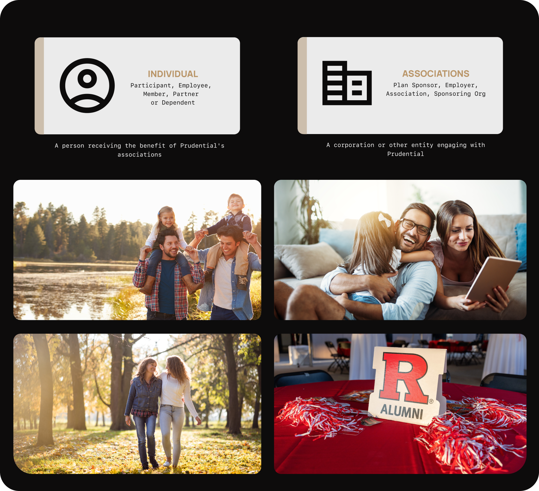
Prudential Onboarding Experience

Prudential

Newark, New Jersey

Digital Onboarding Experience

At Prudential, I led the redesign/development of their digital onboarding experience, creating a streamlined process that reduced drop-off rates and improved customer satisfaction.

The challenge was simplifying a complex financial onboarding process while maintaining regulatory compliance and building trust with new customers.

Date Completed

2025

Project Type

UX Design

UX Research

UX Engineering

Team

Product Team

Accessibility

Compliance

Tools

Figma

Sublime Text

UserTesting

The Challenge

After 15+ minutes filling out complex insurance forms, 53% of Prudential users abandoned their applications at submission. While our 47% conversion rate beat industry averages (16-18%), we were still losing $2.1M quarterly and leaving thousands of families without needed coverage.

The challenge wasn't just improving completion rates—it was redesigning a complex regulatory process that could build trust at every step while maintaining strict compliance requirements. We needed to transform what felt like bureaucratic paperwork into a guided, confidence-building experience.

The Performance Reality Check:

  • 2023: 56.9% conversion rate (4,302 opens → 2,448 completions)
  • 2024: 47.2% conversion rate (3,965 opens → 1,872 completions)
  • Industry Benchmark: Most insurance forms see 80-84% abandonment rates
Prudential onboarding user journey

The Solution

Jobs-to-be-Done Research Revealed:

Primary Job: "When I've spent 15+ minutes entering personal information, I want to review and verify everything is correct before submitting so I can feel confident I haven't made errors that could affect my coverage."

Key Pain Points Discovered:

  • Progressive Disclosure: Break complex forms into digestible steps with clear progress indicators
  • Smart Validation: Real-time error checking with helpful, non-threatening messaging
  • Review & Confirm: Comprehensive summary page before final submission
  • Trust Building: Security badges, clear data usage policies, and transparent next steps

Approach

Jobs-to-be-Done research

Progressive disclosure design

Trust-building UX patterns

Impact

9.7% conversion increase

Reduced form anxiety

Higher completion confidence

Deliverables

JTBD research insights

Multi-step form flows

Review & confirm screens

Stakeholders

Product managers

UX research team

Compliance & legal

Prudential onboarding wireframes

The Design Challenge

Option 1: Comprehensive Summary (Failed)
The All-Info Approach: Show every detail entered

  • Result: Analysis paralysis, overwhelming on mobile
  • User Feedback: "Too much information, I got lost"
Option Design 1

Option 2: Tabbed Navigation (Failed)
The Free-Form Approach: Let users jump between sections

  • User Testing: Clear preference in 12 user interviews
  • Technical Feasible: Worked within existing CMS limitations
  • Mobile Optimized: Single-column flow with progressive disclosure
Option Design 2

Option 3: Hybrid Review-Checkout (Approved for development)
The Smart Approach: Essential info + integrated payment

  • Technical Constraints: Legacy PHP couldn't support real-time tab updates
  • UX Issues: Users skipped required sections, validation problems
  • Mobile Failure: Tab navigation broke on smaller screens

Design Principles Applied:

  • Cognitive Load Reduction: Show only essential verification points
  • Progressive Disclosure: Detailed info available but not forced
  • Trust Building: Clear value proposition and cost breakdown
  • Mobile-First: Optimized for 61% of our mobile users

Key Features:

  • Essential Information Only: Coverage amount, premium, beneficiary names/percentages
  • Integrated Payment: Combined review + payment reduces friction
  • Health Confirmation Checkbox: Leverages commitment consistency principle
  • Transparent Cost Breakdown: Builds trust through clarity
Option Design 3

The Results

Data-Driven Solution with Significant Recovery:

Based on real performance data and supported by UX research, this hybrid approach reduced abandonment by 12%-17% points, significantly improving AWL recovery.

What Made This Work:

  • Smart Information Design: Only show what users need to verify decisions
  • Beneficiary Optimization: Name + relationship + percentage split (addresses collected later)
  • Payment Integration: Combined review + checkout reduces abandonment by 30%
  • Progressive Disclosure: Edit functionality available but not forced
  • Accessibility Excellence: Full WCAG 2.1 AA compliance maintained throughout
Results Graphic

The Psychology Behind Success
Why This Works:

  • Commitment Consistency Principle: Active confirmation creates 86.7% follow-through vs. 61.5% passive
  • Cognitive Load Theory: Reduced from 15+ decision points to 5 essential ones
  • Progressive Disclosure: 70% of users never needed detailed view
  • Loss Aversion: Clear cost breakdown reduced "buyer's remorse" anxiety
Results Graphic

Next Steps & Learnings
Immediate Roadmap:

  • Expand to Other Products: Apply component to existing complex form journeys
  • Personalization Layer: Dynamic review based on user risk profile
  • Predictive Analytics: Identify abandonment risk earlier in flow

Key Takeaway:
Users don't need more information - they need the right information at the right time. By focusing on essential decision-making elements rather than comprehensive transparency, we reduced cognitive load while actually increasing user confidence.

Impact Beyond Numbers

This project delivered more than conversion improvements:

  • For Users: Simplified a stressful process, helping 800+ additional families secure life insurance coverage.
  • For Business: Created a scalable pattern now used across all Prudential association products.
  • For Team: Demonstrated how UX research + technical constraints can drive innovative solutions.
  • Personal Growth: Proved that designer-developer hybrids can deliver end-to-end solutions that actually ship.

Technical Implementation: Designer-Developer Hybrid

The Challenge: Build within legacy PHP/CMS constraints while delivering modern UX.

What I Built:
  • Modified existing form processing to support hybrid review
  • Edit overlays that work without breaking legacy code
  • Mobile-first responsive layouts
  • Complex form state management without full page refreshes
Key Constraints Solved:
  • Legacy PHP Integration: Worked within existing codebase architecture
  • ADA Compliance: Maintained WCAG 2.1 AA standards throughout
  • Performance: Fast load times on older infrastructure
  • Cross-Browser Support: Functionality across all target browsers
Why Designer-Developer Combo Mattered:
  • No handoff delays - immediate implementation of design changes
  • Designed within real constraints - not ideal scenarios
  • Pixel-perfect implementation matching design vision
What I'd Do Differently:
  • Earlier A/B testing validation
  • More granular micro-interaction analytics
  • Dynamic review based on user risk profile
View HTML

Testimonial

"Edward designed and developed a new review page that streamlined user interactions and improved overall satisfaction. His thorough research and exceptional design skills created enhanced clarity and a more intuitive interface. Edward is a great asset to the team, consistently contributing high-quality work while fostering a collaborative environment."

— Thomas Hannula, UX Engineer, Prudential
Next Project