Clinicians 40% 
Patients 25%
Time. The one thing doctors can't prescribe themselves. Every year, we ask physicians to do more with less of it. The future of healthcare shouldn't force us to choose between being efficient and being human.
ROLE
Lead UX Strategist
YEAR
2024
DURATION
6 months
CROSS-FUNCTIONAL
Healthcare Professionals
Product Manager
Dev & IT Team
STRATEGY
UX Innovation
User Research
Data Analysis
ARCHITECTURE
AI Integration
Web3/Blockchain
IPFS Storage
DESIGN
UI/UX Design
Documentation
System Flows
MENTORSHIP
Junior Designer
Design Intern
Restoring the human touch in healthcare
A platform turns the natural rhythm of patient care into seamless documentation. No translation needed. No moments lost.
I led the UX strategic innovation for a cross-functional group that I assembled, including healthcare professionals, developers, designers, and a product manager to create Arthe, an AI-powered documentation solution that directly addressed the daily challenges faced by healthcare providers and their patients.
Initial Discovery Phase
Our journey began with stakeholder insights, moving to hands-on research with hospital staff and patients. This 6-week process gave us the foundation for everything that followed.
Through user-centered design methods, we:
- Identified critical pain points in current systems
- Mapped doctor-patient documentation flows
- Prioritized features based on user impact
Week 1: 5 stakeholder interviews
Week 2: 12 hospital staff shadowing
Week 4: 28 patient interviews started
Week 6: 45 total sessions initiated
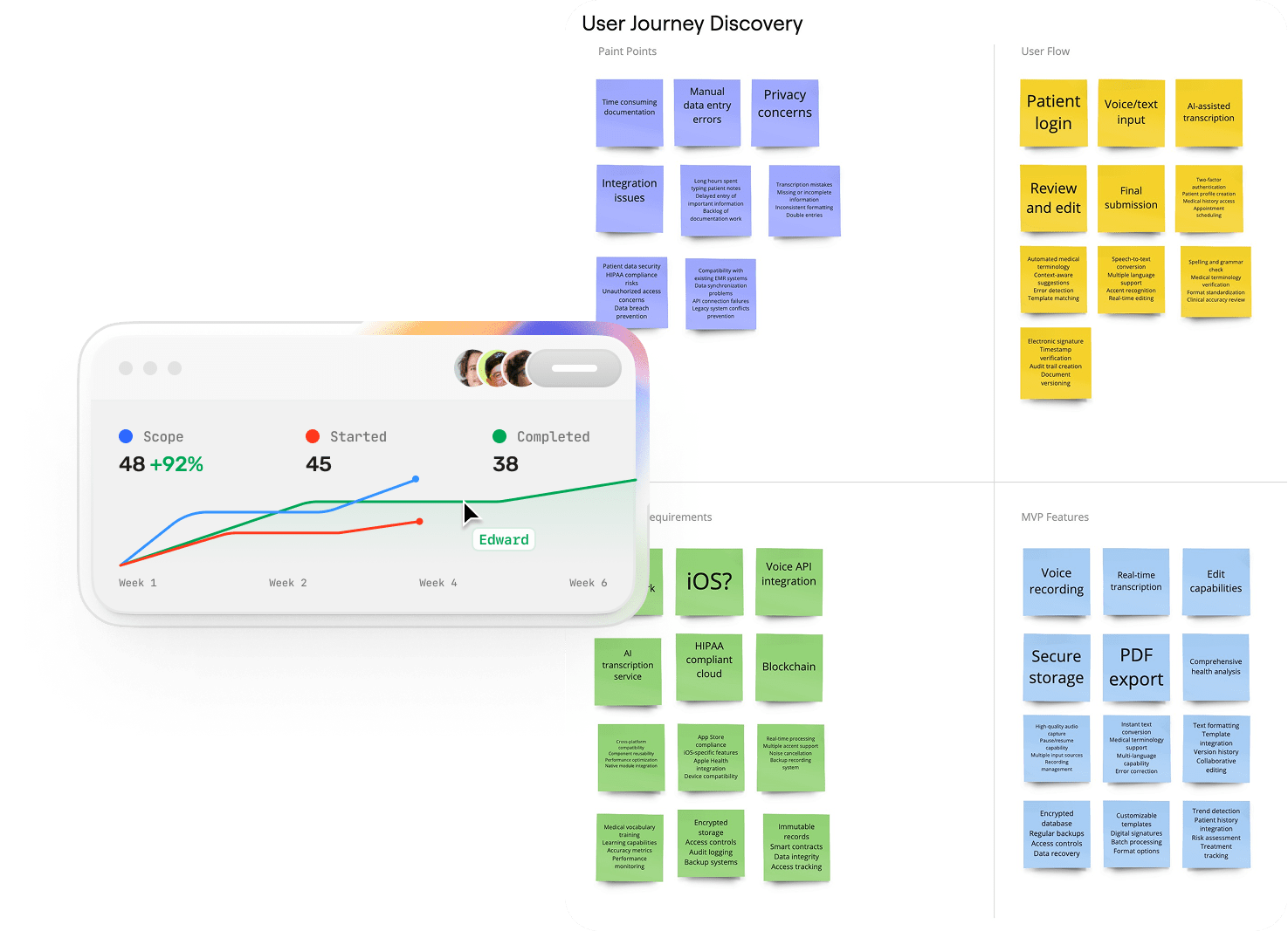
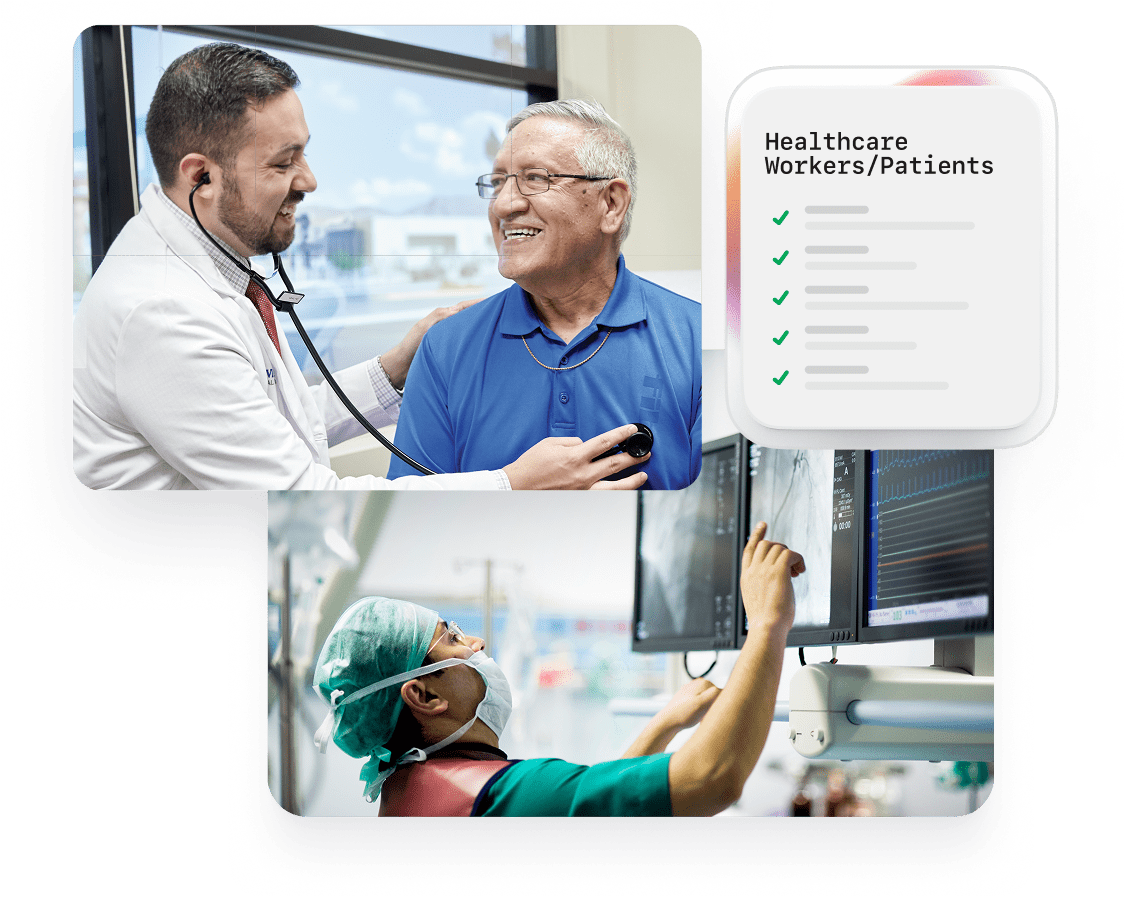
Problem for Patients
- Visits feel rushed, with less face-to-face time with doctors
- Harder to ask questions and understand their health
- No easy way to review what was discussed during visits
- Concerns about the privacy and security of their medical records
Problem for Healthcare Workers
- Doctors and Clinicians spend too much time on paperwork
- Less time to talk with and care for patients
- Overworked and unhappy healthcare workers
- Current solutions don't work well and aren't secure

Collaborative Sessions
For 50 Physician Practices (including employees and patients):
- $962K saved from reduced documentation time.
- $7.3M earned from seeing one extra patient per doctor per day.
Total Efficiency Gain: $8.26M annually
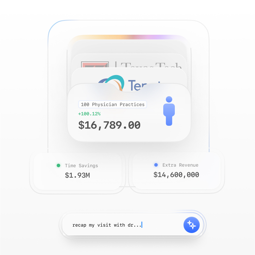
For 100 Physicians (including employees and patients):
- $1.93M saved from reduced documentation time.
- $14.6M earned from seeing one extra patient per doctor per day.
Total Efficiency Gain: $16.53M annually
The Solution: Arthe
- Utilizes AI to streamline clinical documentation, allowing healthcare professionals to dictate notes effortlessly
- Optimizes time management and minimizes errors, enabling doctors to dedicate more time to patient care
- Empowers patients with comprehensive visit summaries and AI-assisted support for follow-up questions
- Employs blockchain technology to ensure records are secure, tamper-proof, and easily auditable
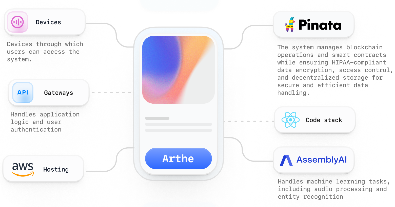
Technical Discovery
While heading up UX strategy, I made key decisions about our tech stack: ReactJS, AWS, AssemblyAI, and Pinata. This balanced our requirements with budget constraints, enabling secure authentication, AI processing, and decentralized storage. The PWA approach with ReactJS gave us offline access and cross-platform compatibility, though it meant working around push notification and camera limitations. Understanding these boundaries early helped shape realistic UX decisions throughout development.
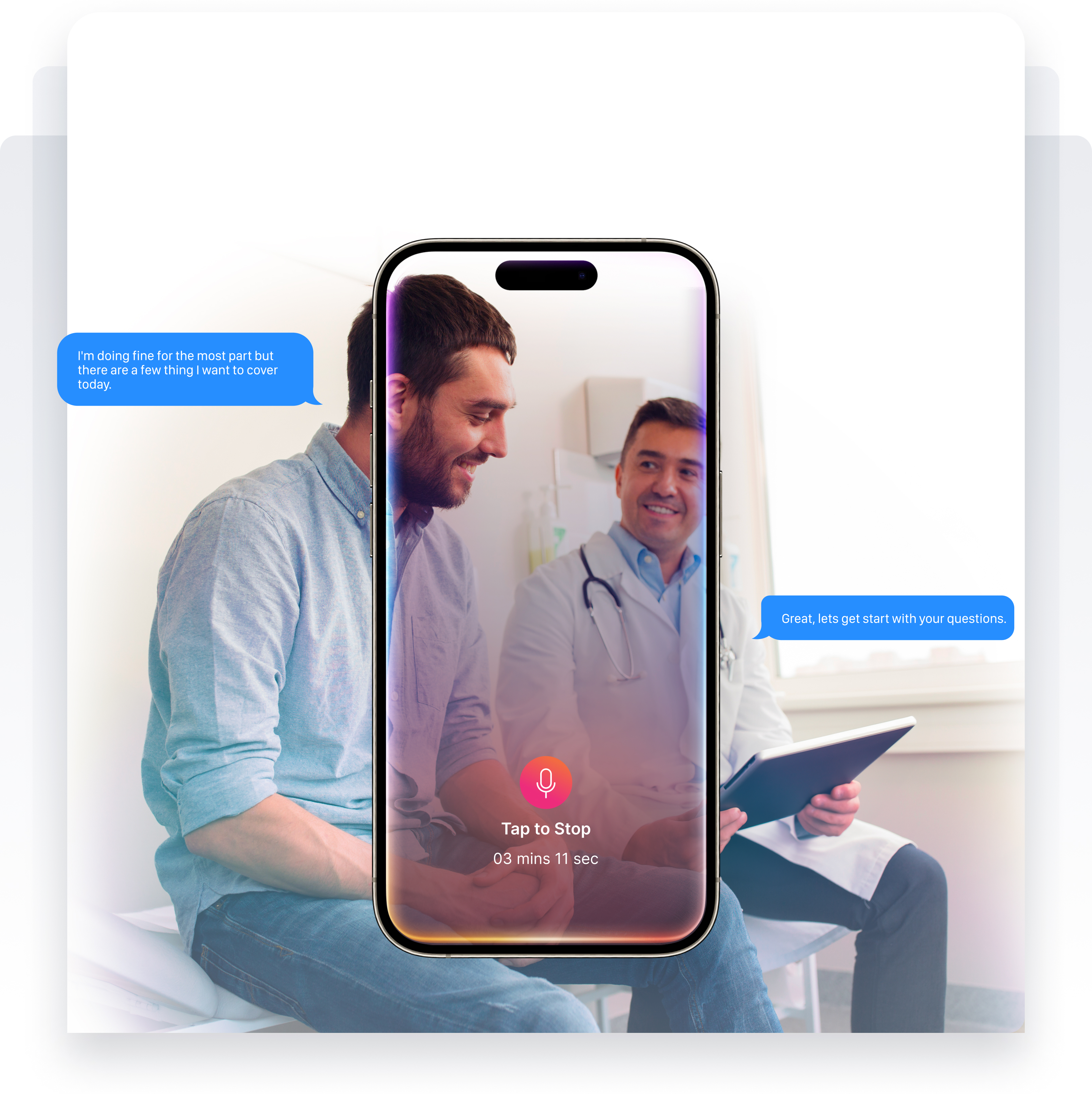
The Design Process
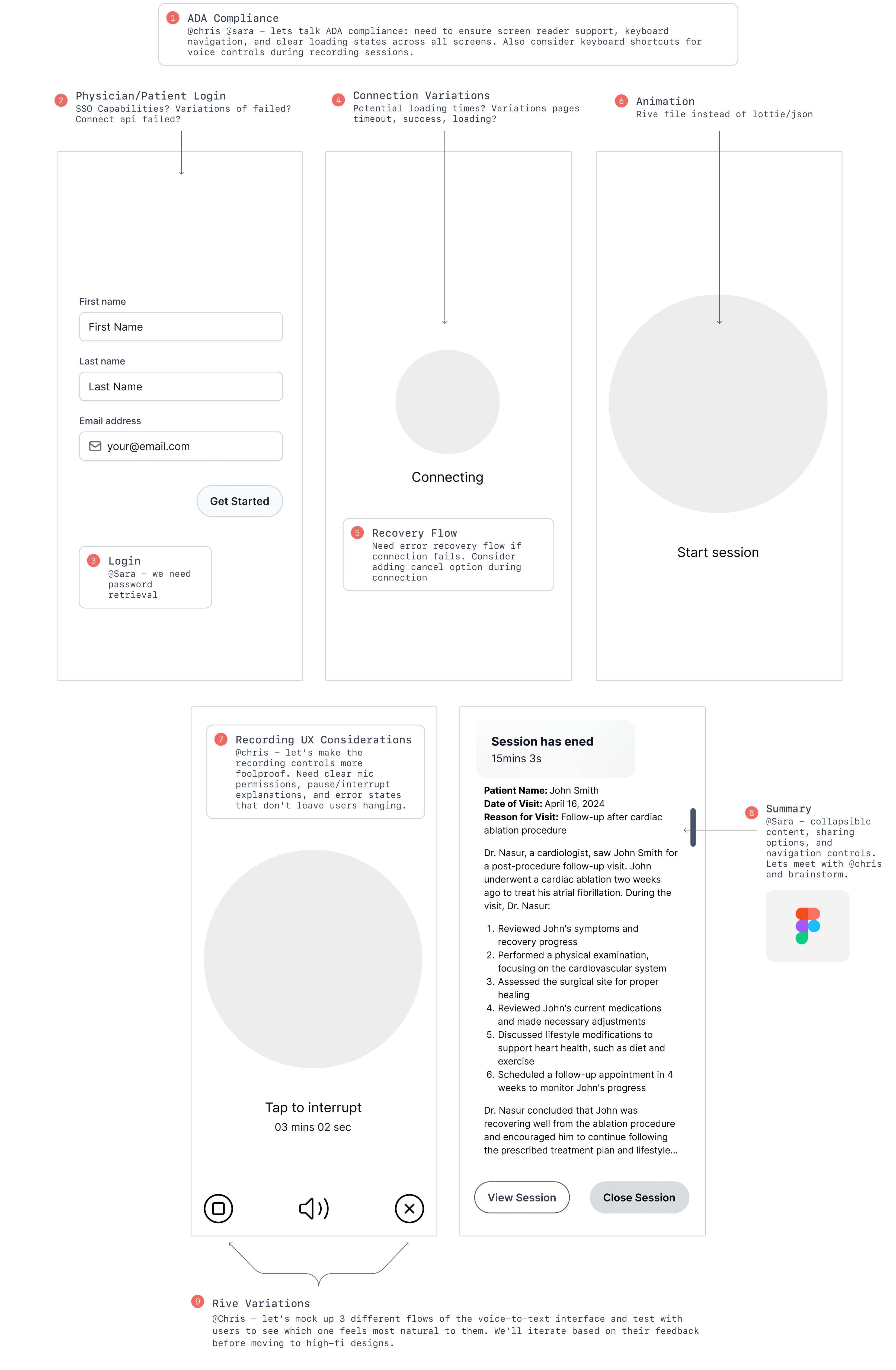
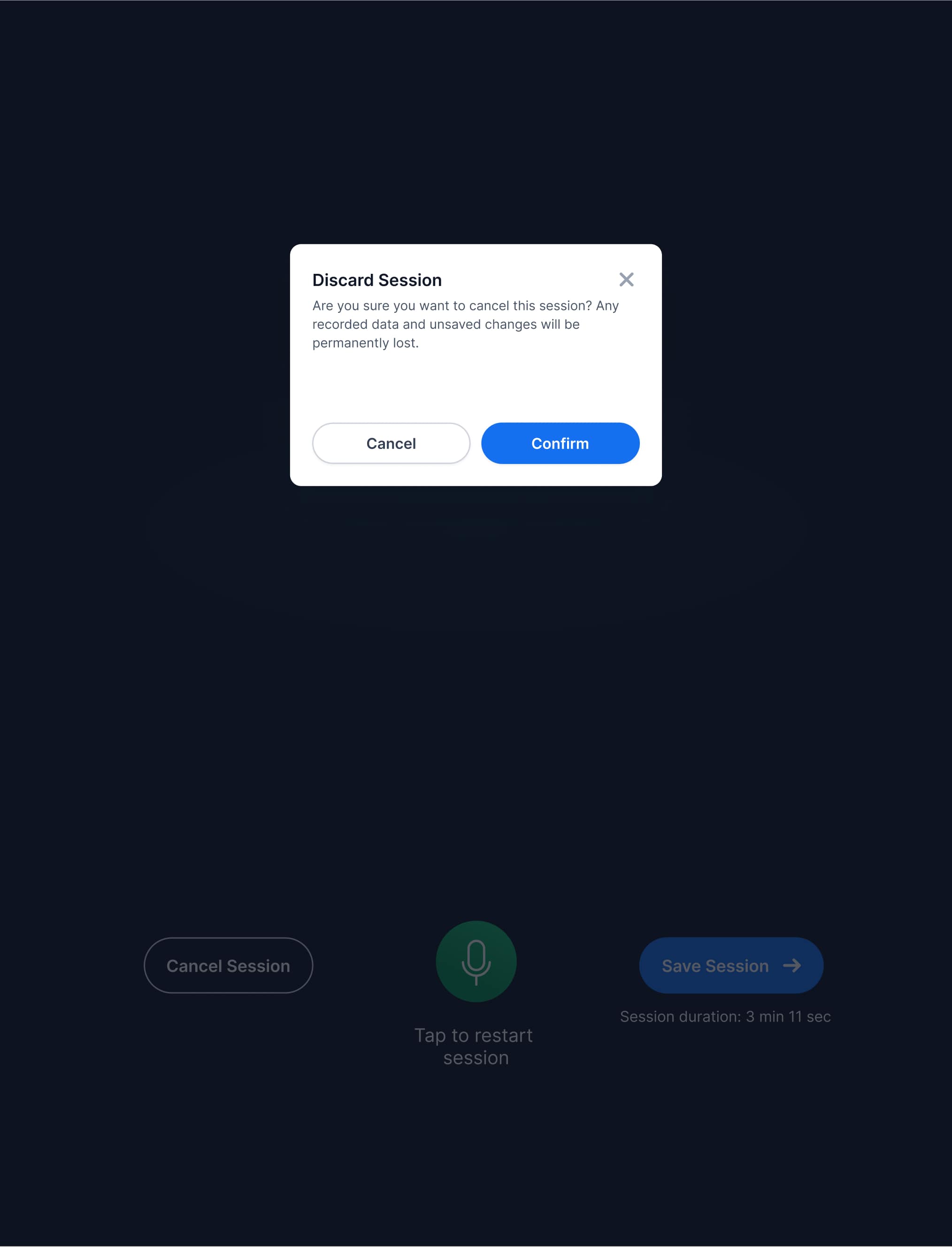
We kicked off with the voice interface - it was the clear pain point we needed to solve first. The rest - dashboards, logins, all of that - could wait. Following user-centric design principles, we started with a mock clinic in our office. Our team's doctor-patient role-play scenarios, while entertaining at times, revealed exactly what doctors needed: quick start/stop recording, visual feedback, easy corrections, and smart context awareness (like knowing when they're discussing medications vs. symptoms).
The remote telemedicine sessions came next, proving invaluable for testing our iterations. Working with physicians in their virtual environment showed us how the interface needed to adapt. Only after refining through these stages did we move to physical sessions with actual patients. This phased approach, carefully measuring outcomes at each step, helped us build an interface that truly worked in real clinical settings.
Collaborative Sessions
Using Miro's and Dovetail, we transformed collaborative mapping sessions into actionable insights:
- Leveraged Miro AI to analyze user flows and generate initial feature briefs
- Streamlined documentation of our healthcare web app journey
- Converted whiteboard sessions into structured product requirements
- Validated technical feasibility while maintaining design vision and budget
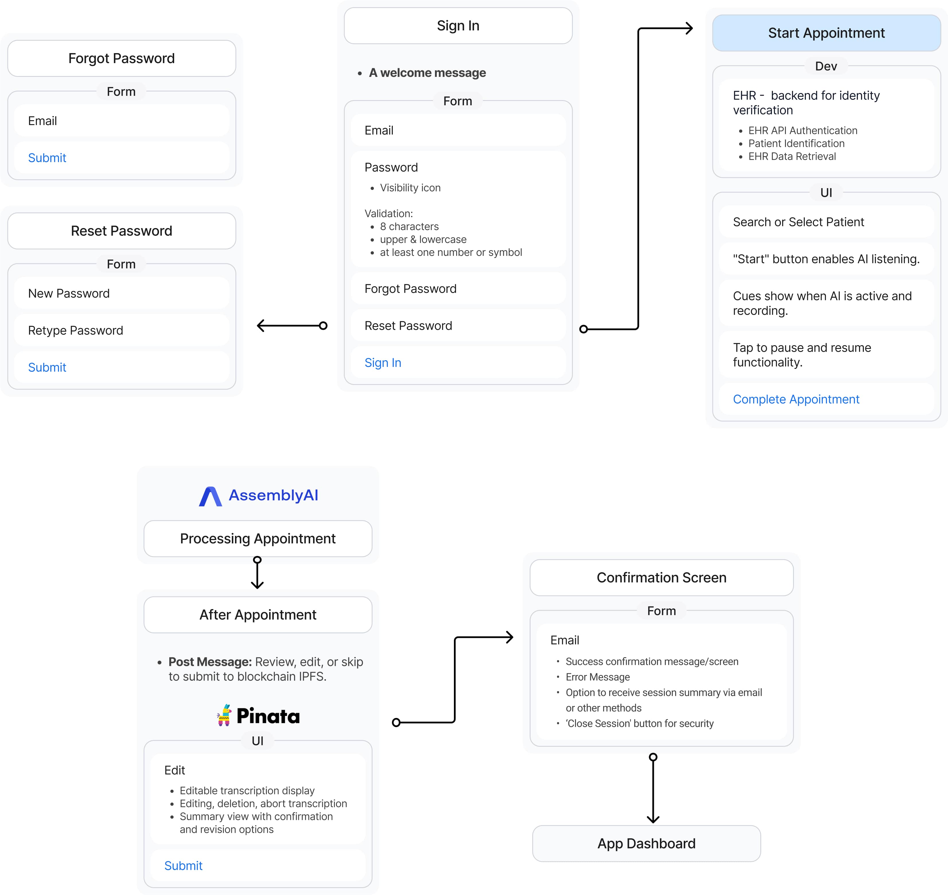
Low-Fidelity Wireframes
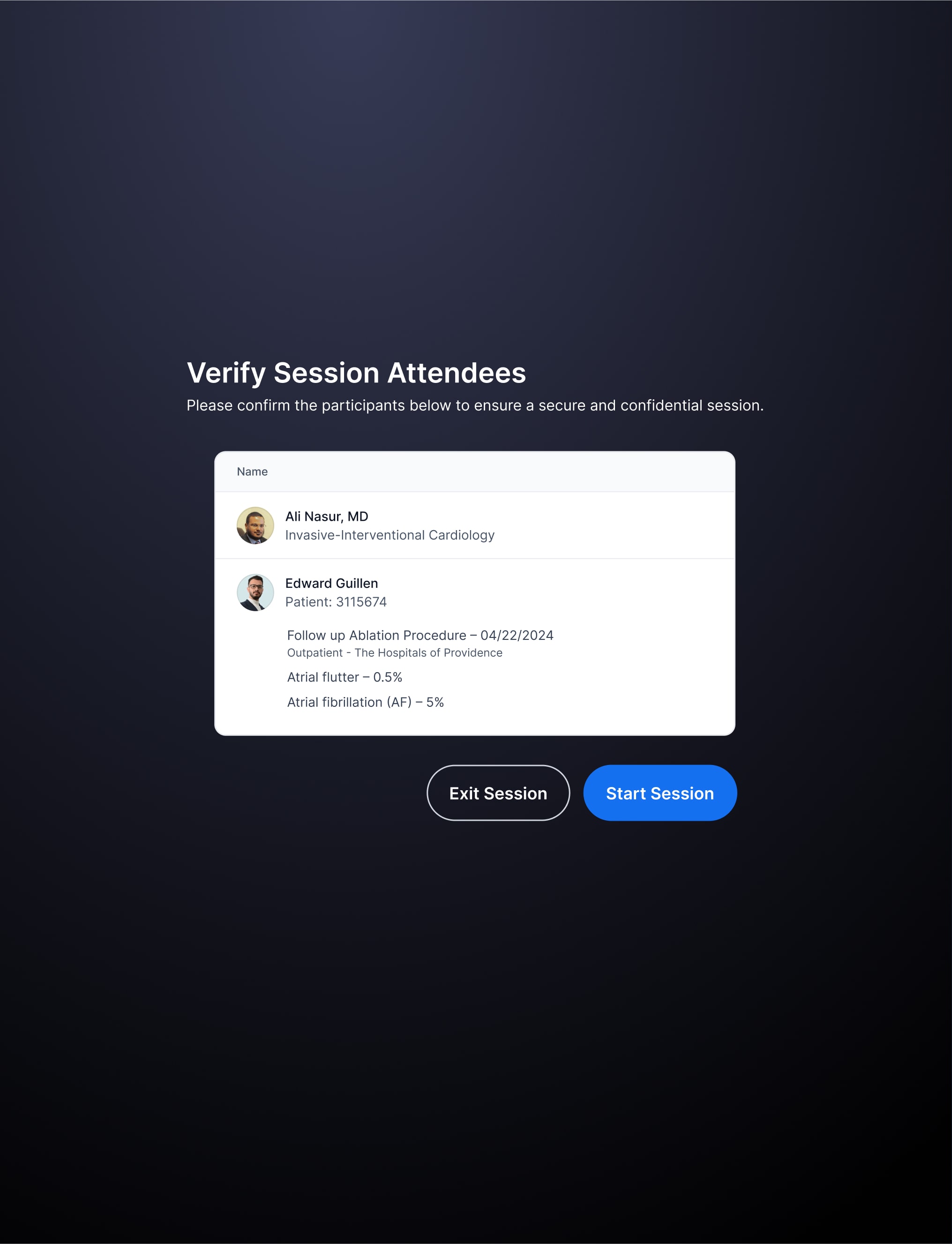
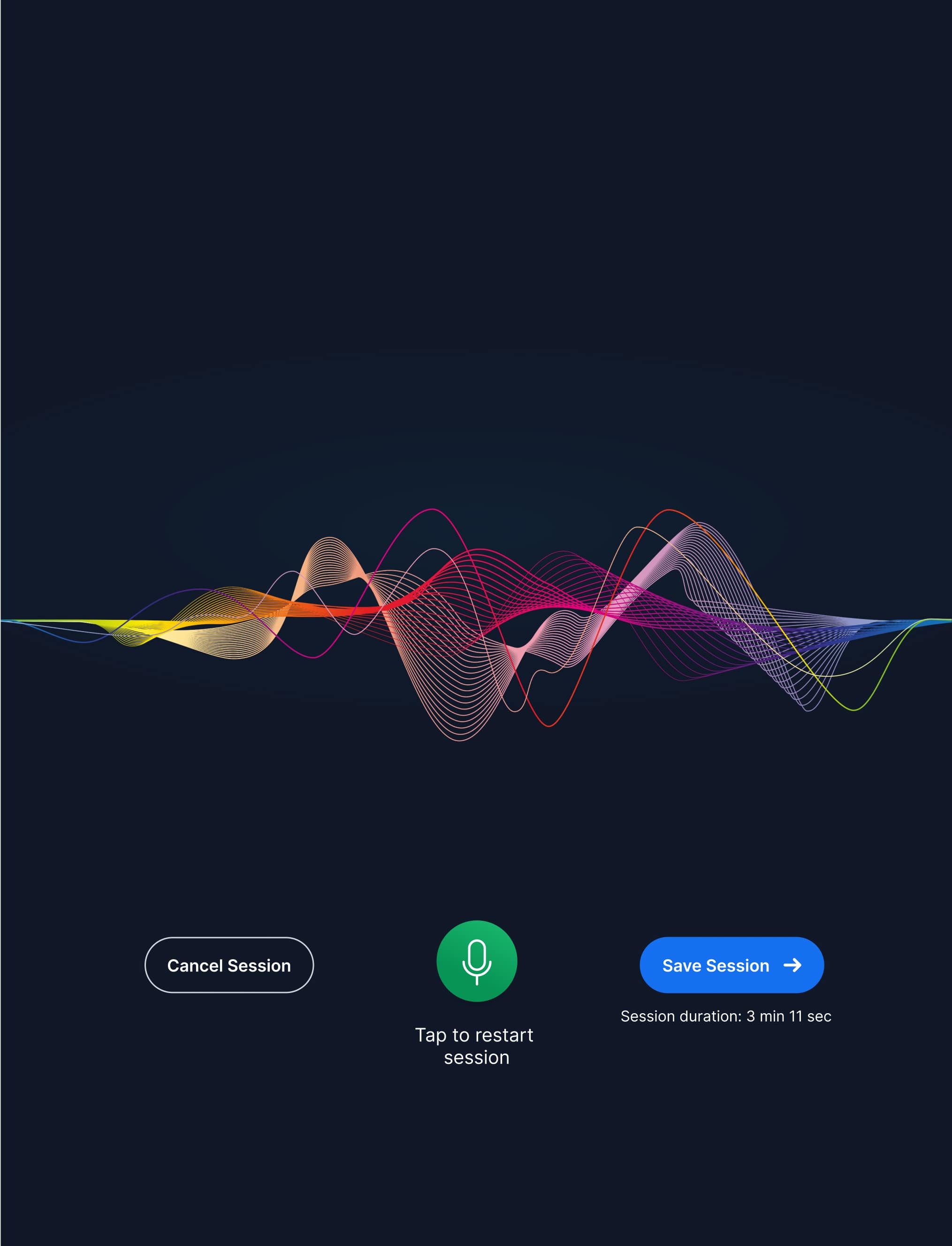
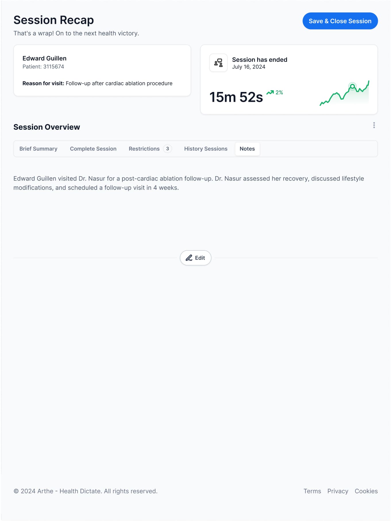
Starting with the core UI components, we designed wireframes focusing on a seamless user flow - from the initial user onboarding screen through the connection interface, to the main voice recording dashboard with a prominent timer, and finally to the results display and summary views, enabling us to quickly test the essential voice-to-text features.
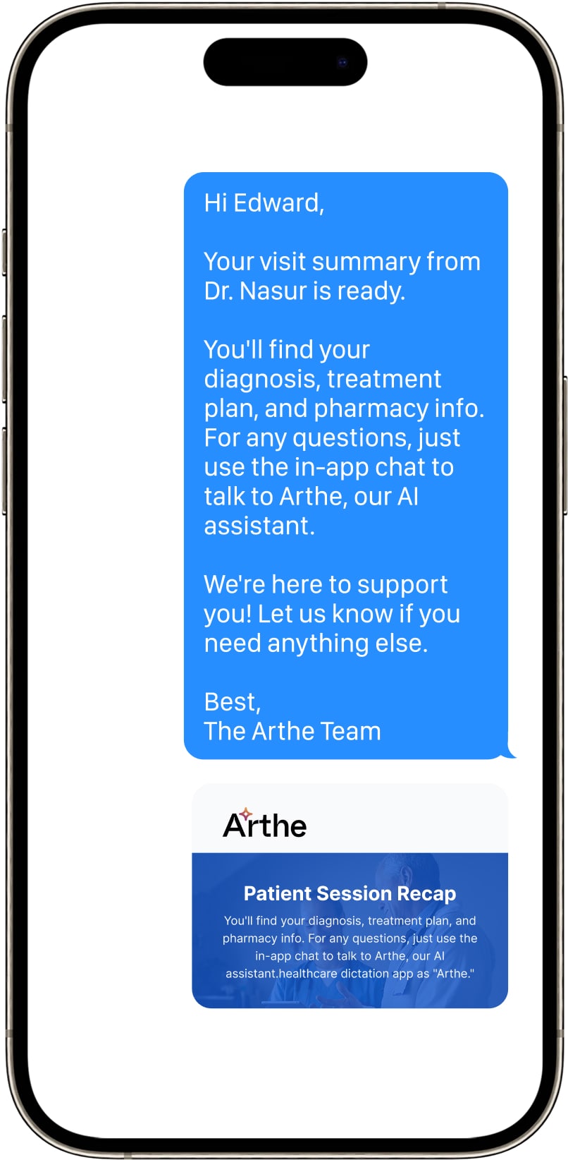
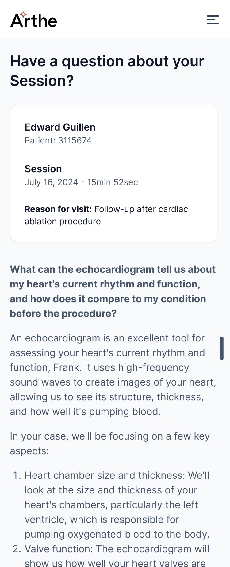
The Patient Experience
This is where things got really interesting. We realized we weren't just designing for doctors - we needed to make medical information accessible to patients too. We created:
- Simplified medical summaries
- Visual progress trackers
- Easy-to-understand medication schedules
- A way for patients to submit questions before appointments

Technical Challenges
Oh boy, were there challenges! The voice recognition was particularly tricky:
- Medical terminology is complex
- Doctors speak quickly
- Background noise in hospitals
- Multiple accents and speaking styles
We ended up training our AI on over 10,000 hours of medical dictation.
Fun fact: our AI initially thought "myocardial infarction" was "my accordion infection" We've come a long way since then!
Security was another huge challenge. Healthcare data is serious business. We implemented blockchain technology for security. As one doctor told us, "I don't care how it's secure, I just need to know it is.”
User Testing & Feedback
Once we had a functional mid-fidelity UI in place, we were able to conduct extensive testing and gather usability interview feedback.
- 20+ hours of recorded sessions
- 15 remote usability studies
- Alpha testing with 10 physicians
- Patient feedback groups
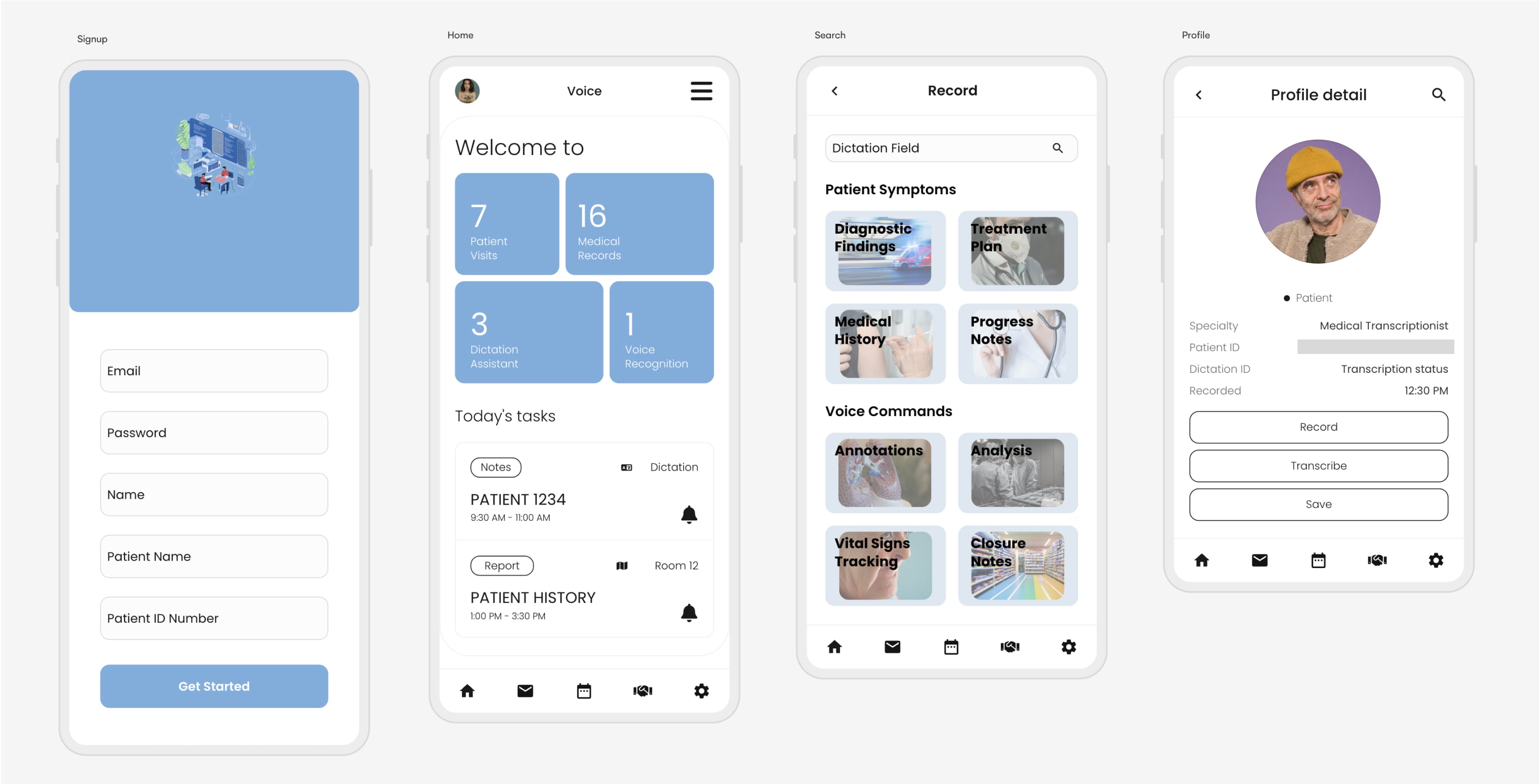
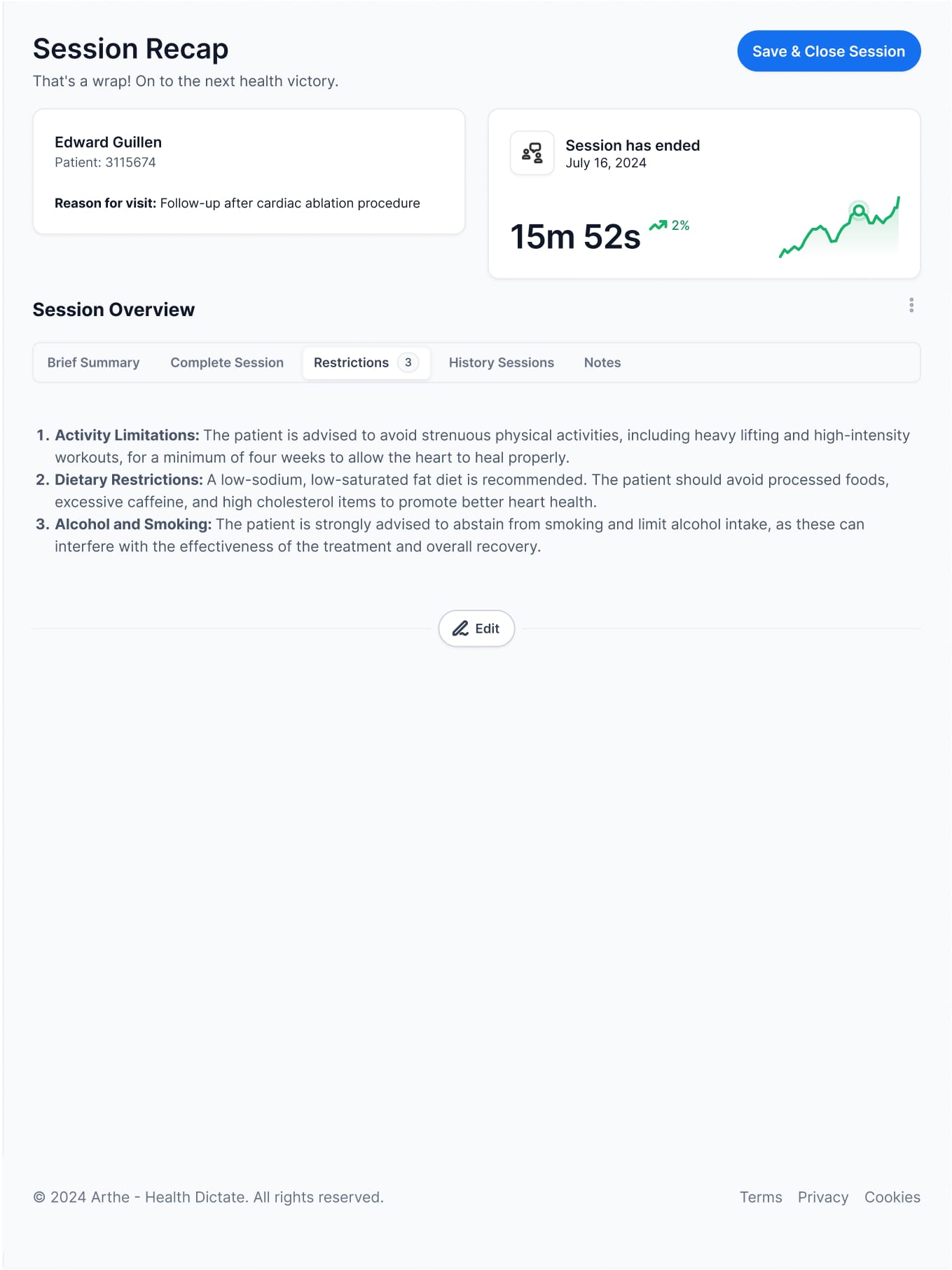
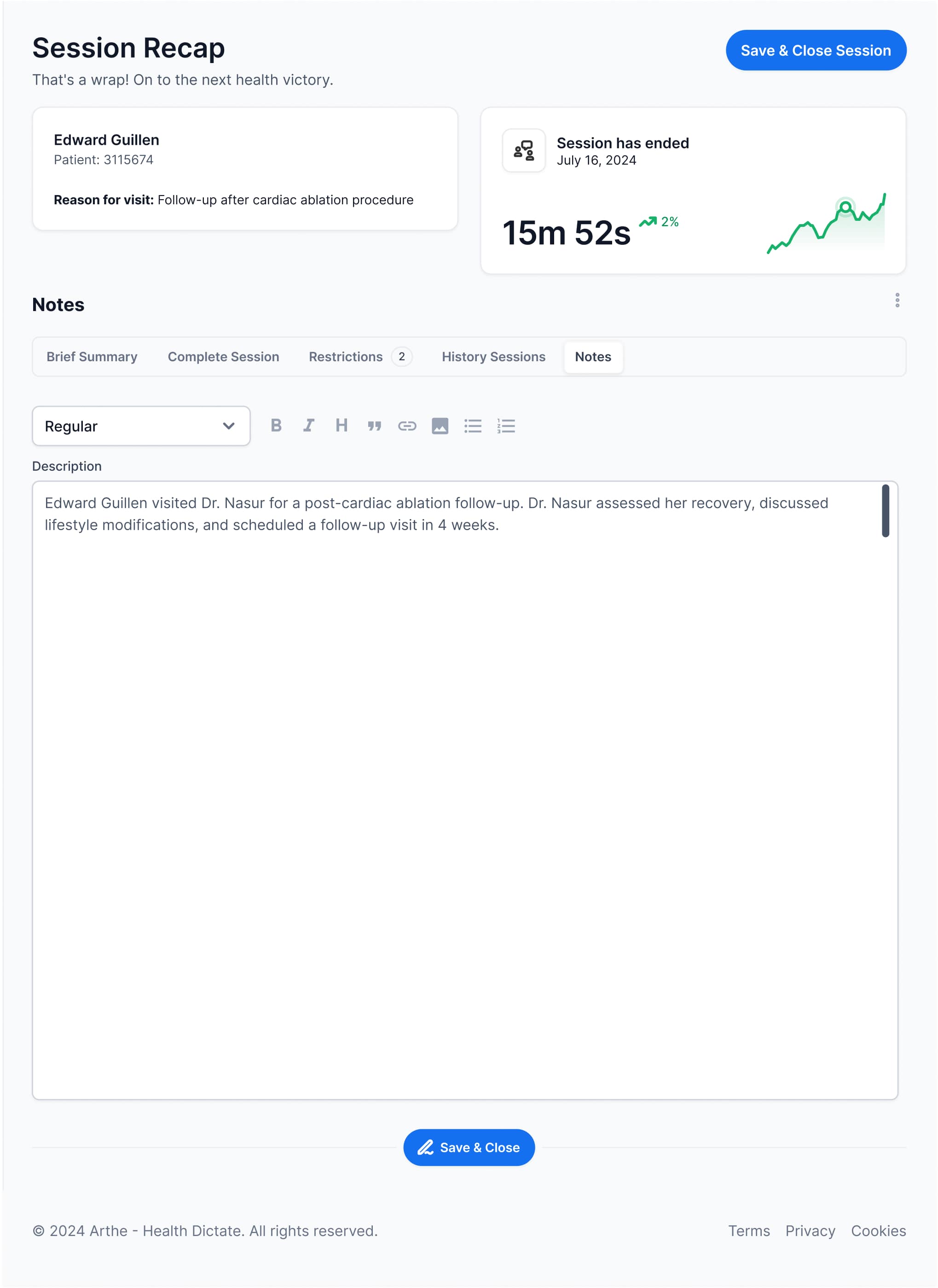
Final Physician Designs
While working through feedback cycles, we built a lean design library alongside everything else. It became our efficiency toolkit - ready-to-use components that let us move quickly without compromising quality. When feature requests came in, we'd pull from the library and adapt, keeping our work consistent and cutting development time in half.


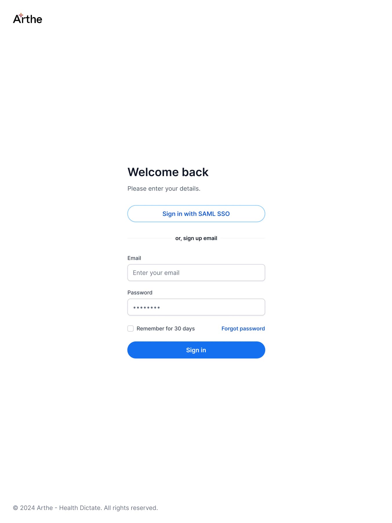
Final Patient Designs
We developed a responsive web application instead of native apps, which saved considerable development costs and time. Though we faced some initial challenges with certain technology stacks, I collaborated closely with engineers and designers to find solutions. The web-first approach allowed us to deploy across platforms simultaneously while maintaining a consistent user experience. This decision proved valuable as we could iterate quickly based on user feedback without managing multiple codebases.

The Results
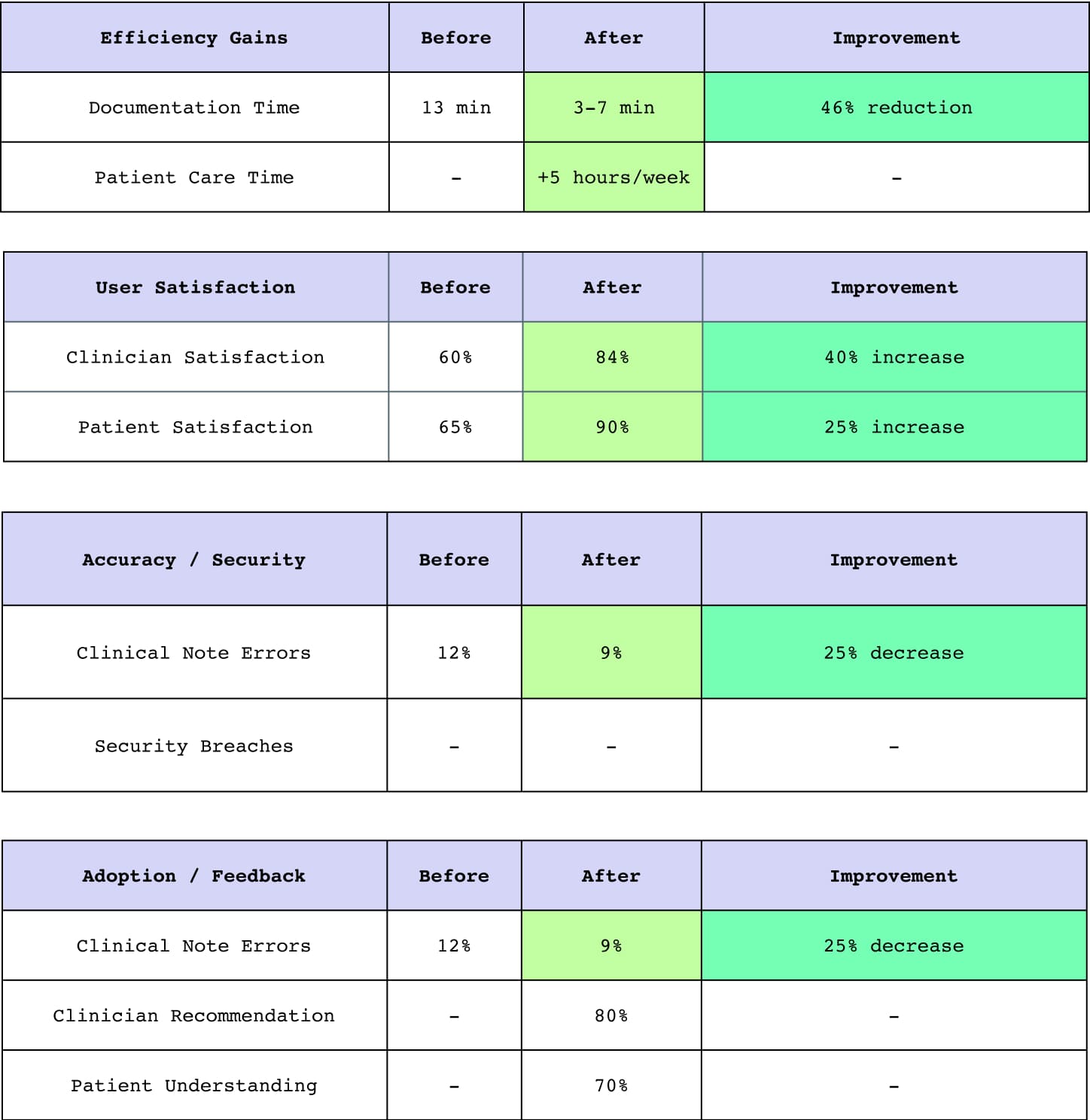
- Documentation time down from 13 minutes to 3-7 minutes
- Patient face-to-face time increased by 40%
- Clinical errors reduced by 25%
- Satisfaction scores up significantly
Current Status & Future
- We've secured funding for an internal team
- Integration with major EHR systems is ongoing
- Monthly subscription model for independent physicians
- Constant updates based on user feedback
Opportunities for Improvement
- Expanding language support
- Specialty-specific modules
- Advanced analytics features
- Mobile version development


Medical Device Disclaimer
Arthe (1) is not designed, intended or made available as a medical device, and (2) is not designed or intended to be a substitute for professional medical advice, diagnosis, treatment, or judgment and should not be used to replace or as a substitute for professional medical advice, diagnosis, treatment, or judgment.
Key Learnings
Iterative Testing Saves Time
We caught several critical usability issues early by testing with real users after each sprint instead of waiting until the end.
Cross-Team Communication Is Essential
Regular sync-ups between designers and developers helped us avoid rework and ensured technical feasibility throughout the process.
Accessibility Shouldn't Be an Afterthought
Building accessibility into our design system from day one made implementation smoother and created a better experience for all users.
Data Informed Our Decisions
Analytics from the previous version guided our redesign priorities and helped us focus on solving the most impactful problems first.
Less Is Often More
Removing unnecessary features and simplifying workflows ultimately created a more focused product that users could learn quickly.
Cisco
Turning a strategy into an engaging presentation provided insight into high-level planning and decision-making.