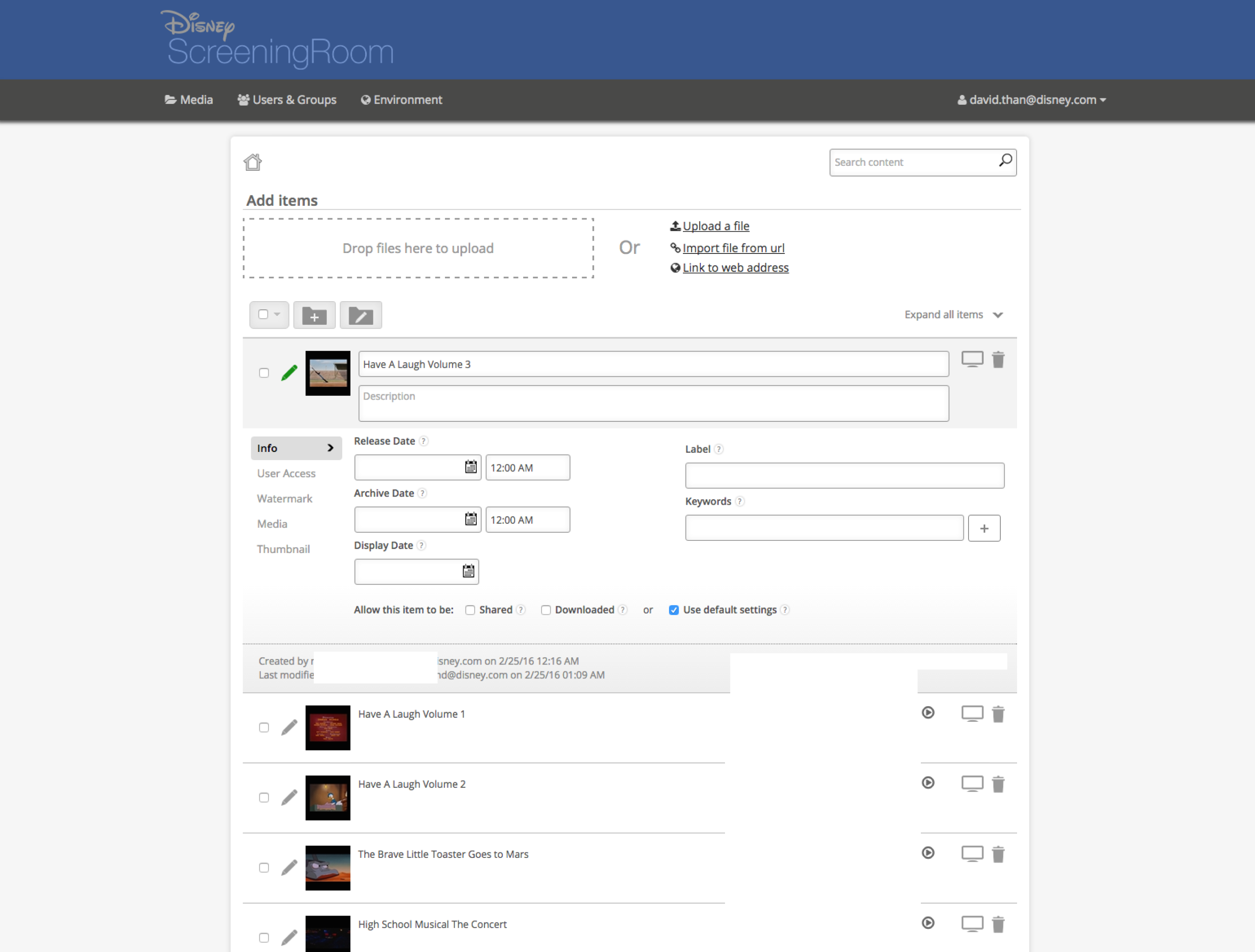
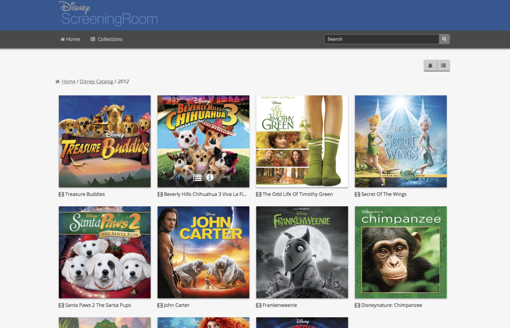
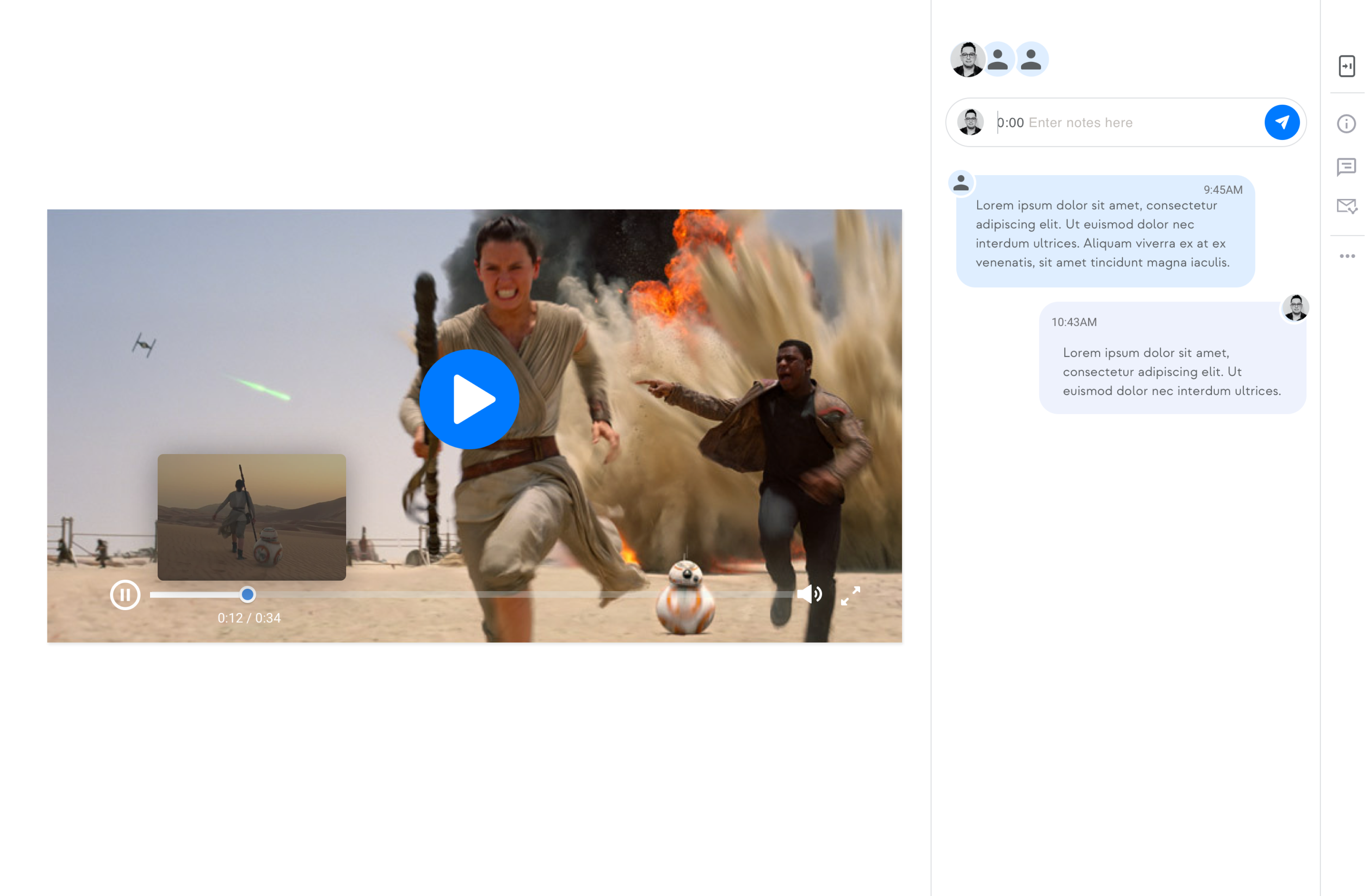
I focused on studying existing designs and what's popular in the market, since we couldn't do user research. This helped me make smart design choices that fit both our business goals and what users likely want. This approach played a big role in improving how Disney teams share media content.
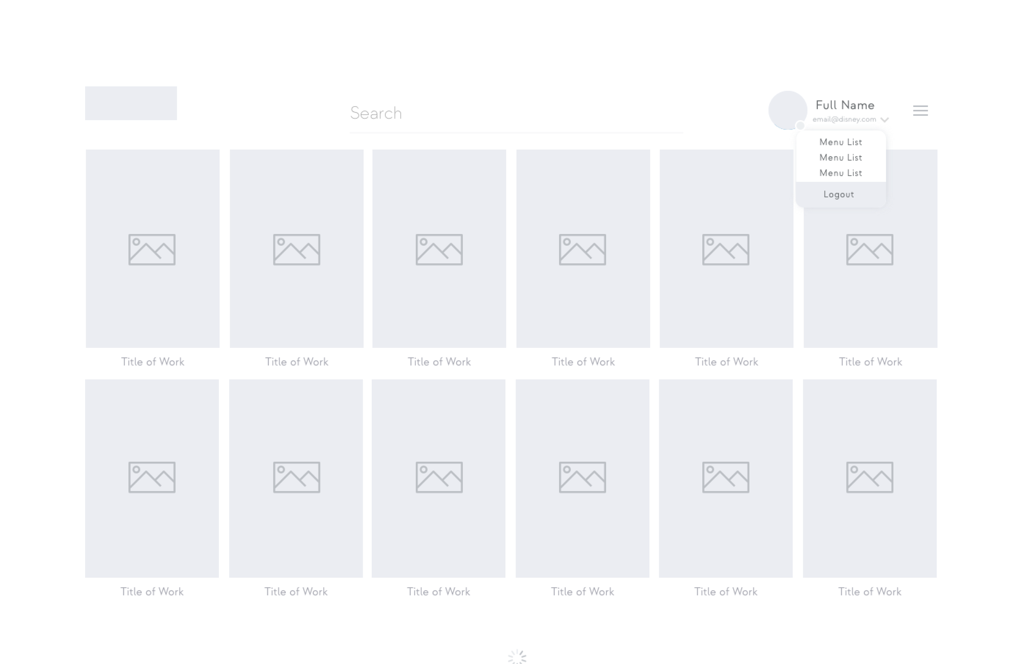
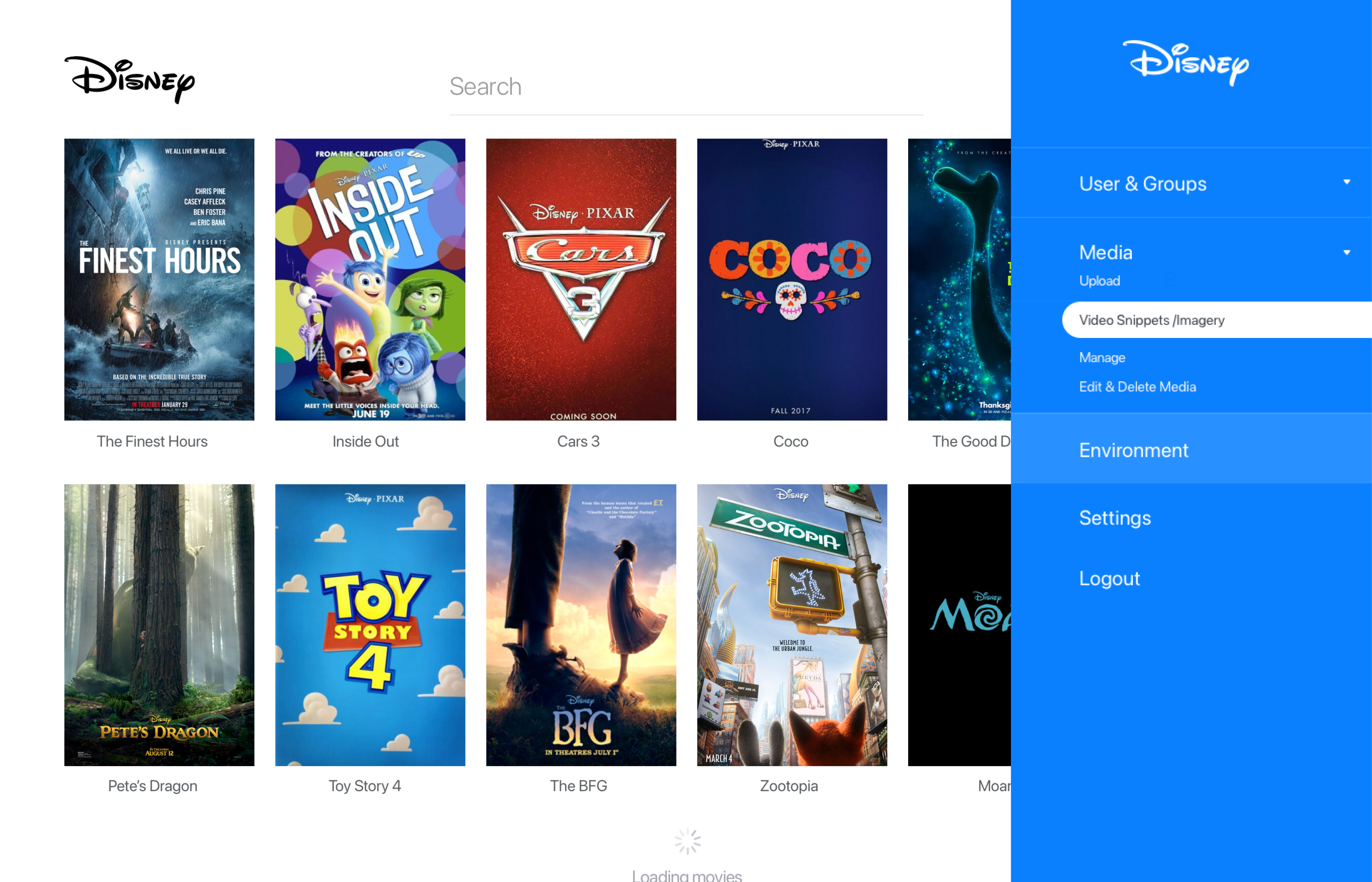
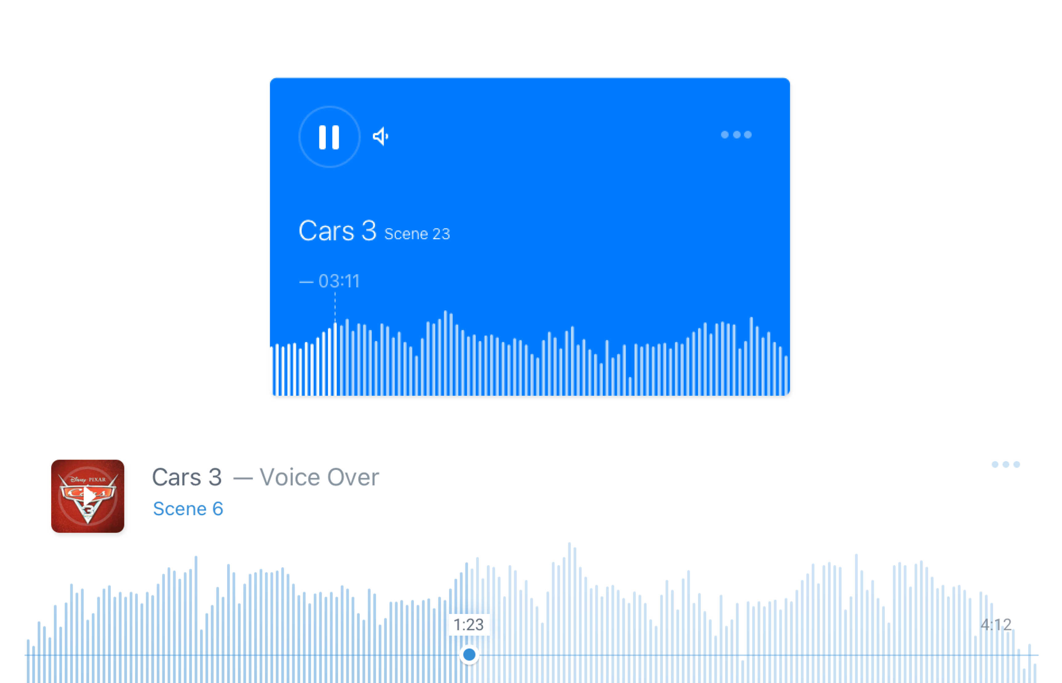
The team wanted a design that felt both intuitive and familiar to users, echoing popular apps they already knew. By incorporating elements from well-known platforms like iTunes, we made it easy for Disney teams to adapt to our new media-sharing app. This approach was key to the app's success in improving content-sharing.
I kicked off questions to internal users to understand their needs and pain points. Armed with these insights, I began crafting sitemaps and information architecture. This initial groundwork laid the foundation for a user-friendly app that resonated with our target audience.
I focused on studying existing designs and what's popular in the market, since we couldn't do user research. This helped me make smart design choices that fit both our business goals and what users likely want. This approach played a big role in improving how Disney teams share media content.
The team wanted a design that felt both intuitive and familiar to users, echoing popular apps they already knew. By incorporating elements from well-known platforms like iTunes, we made it easy for Disney teams to adapt to our new media-sharing app. This approach was key to the app's success in improving content-sharing.
Desktop App
Disney
As a contract product designer for the Disney Sneak Peek desktop app, I led the design from concept to completion using a hybrid Waterfall/Kanban approach. I worked closely with cross-functional teams, conducted user and market research, and made iterative changes based on feedback. My efforts resulted in a user-centric app that met business objectives and revolutionized media content-sharing for Disney's creative teams.
Due to the short-term nature of my contract, speed was of the essence. We had to make quick decisions and rapidly iterate on low-fidelity prototypes. This fast-paced approach allowed us to meet our goals while staying responsive to user needs, setting the stage for a successful, user-friendly app.
Thanks to the waterfall-kanban hybrid process we employed, we could swiftly roll out iterations—anything from introducing a dark mode to tweaking UI elements. This agile approach enabled us to adapt quickly, keeping the project on track while continuously aligning with user needs and preferences.

