


Tenet
The Hospitals of Providence
Project Brief
ROLE:
Lead Product Designer
DURATION: 1 Year
DELIVERABLES:
Quantitative/Qualitative Research
Narrative Strategy
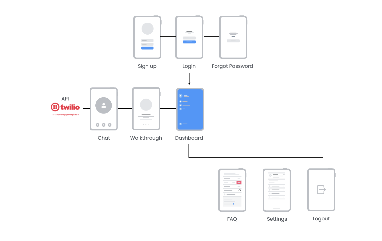
Site Mapping
UX Design
Visual Design
Illustrations and Motion Graphics
Frontend Dev (HTML, JS, CSS)
Testing and Iteration
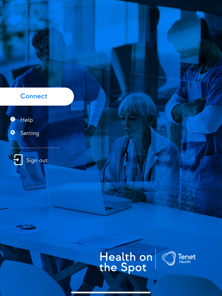
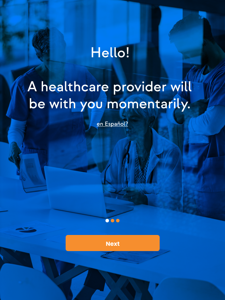
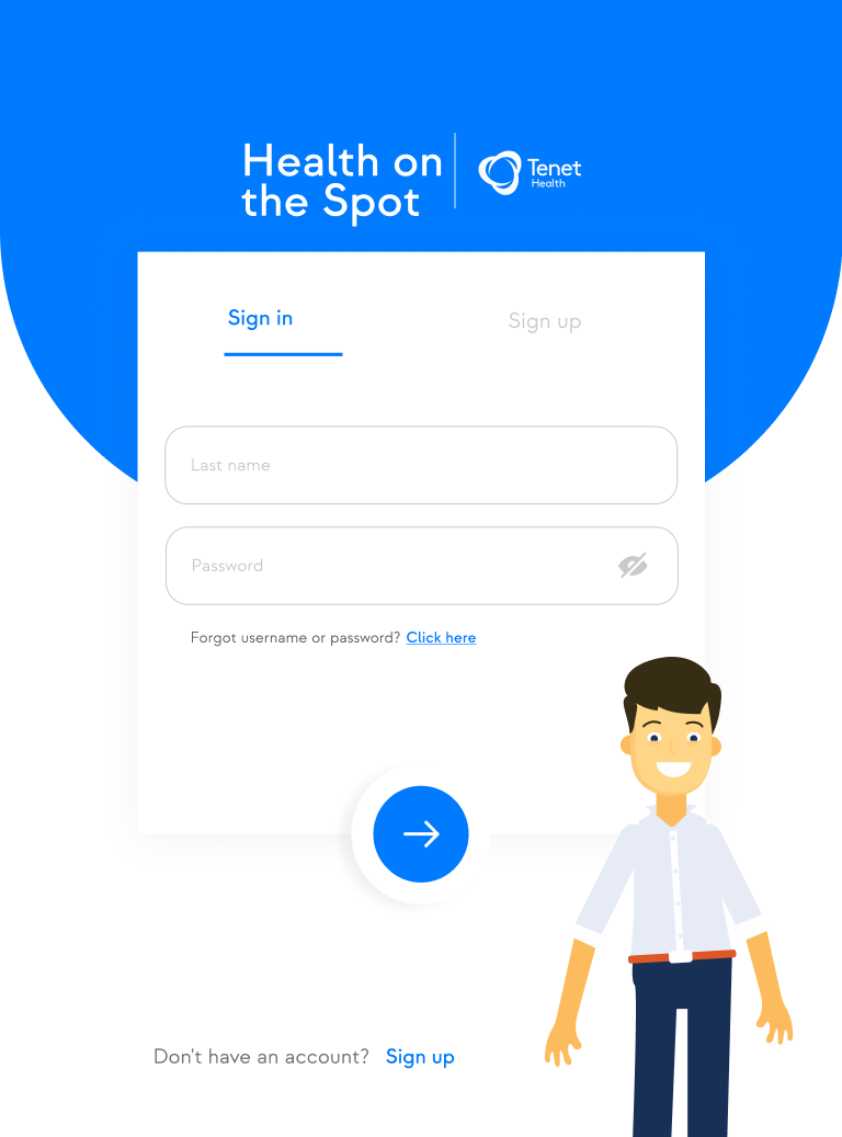
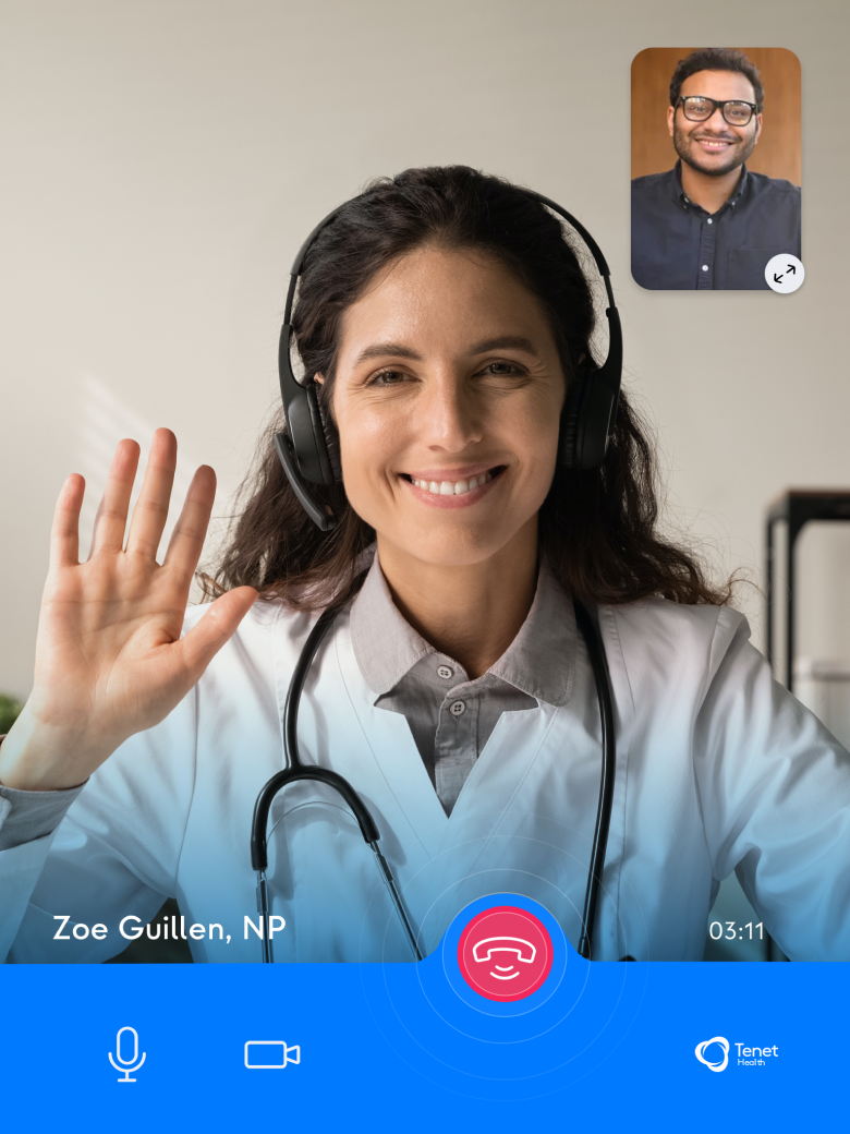
Over my ten years at Tenet Healthcare, I got to dive into a bunch of interesting projects that really stretched what it means to be a full-stack designer. But there's this one project that really sticks out. I led this awesome team of designers and engineers to build a native iOS app specifically for iPads. This wasn't just any app—it was a pilot test for what would become a massive trend: telemedicine. My role was in connecting our team's efforts with stakeholders, employing what I'd come to define as my design thinking approach: focusing on the outcomes, not just the outputs. This project was our forward-thinking solution to streamlining patient-doctor interactions, particularly aiming to alleviate the chronic challenges faced by emergency rooms.
Data from our financial team at The Hospitals of Providence in El Paso, Texas, helped shape our primary persona. We focused on Hispanic individuals between 45-60 years old, mainly working in blue-collar professions. Upholding our dedication, we rigorously followed HIPAA regulations to ensure data privacy. This effort was driven by the pressing issue of overcrowding in emergency rooms.

Design Process
We thought people might not be too excited about joining our workshops, so we came up with some nice perks to get them interested. With our user-centric mindset and the outcomes approach, we received genuine, detailed feedback. We saw increased participation and received genuine, detailed feedback. These insights were essential in refining our internal app development approach. I help both facilitate English and Spanish workshops.

Define the Problem
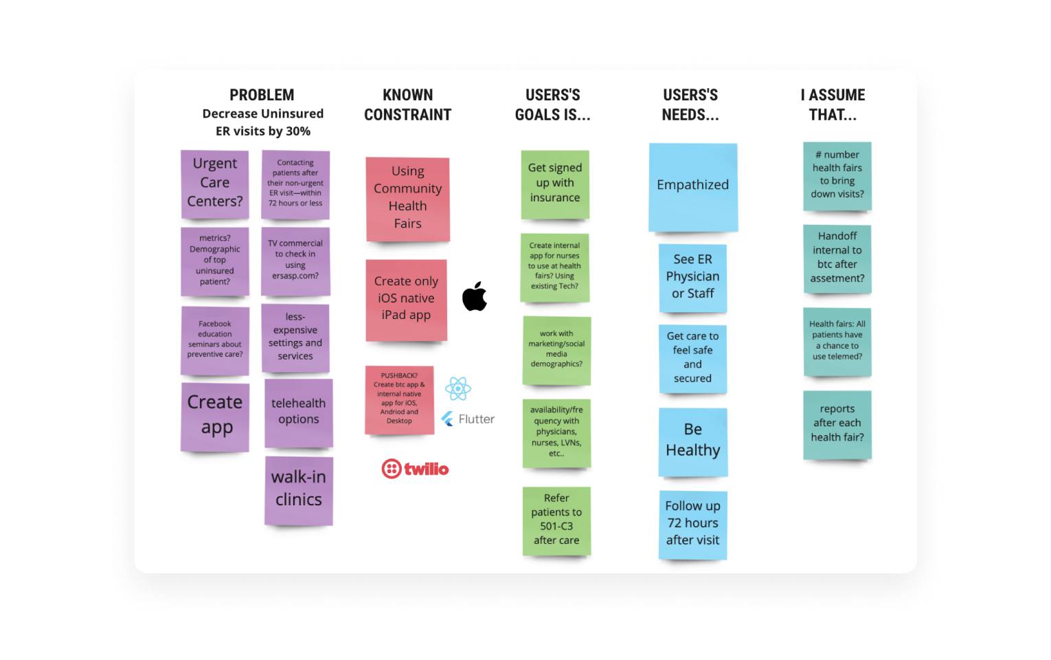
Defined the problem by understanding users' needs and goals, not just focusing on features or immediate fixes
Set the Outcome
Set clear, tangible outcomes aiming for positive changes in user behavior.
Identify Key Metrics
Identified key metrics based on user behavior to gauge success.
Ideate Solutions
Ideated potential solutions with a focus on achieving the defined outcome.
Prototype & Test
Built prototypes, tested them with real users to identify gaps and room for improvement.
Implement solution
Implemented a robust solution after successful testing and monitored key metrics.
Learn & Iterate
Adopted a continuous learning and iterating approach post-launch to meet evolving user needs.
Rinse & Repeat
Embraced an ongoing outcome-based approach, constantly improving and adapting to user needs..
Refining Our App Design
We rolled out user feedback workshops to make sure our app was on the right track. By showcasing our initial designs and engaging in focus groups, surveys, and chats, we got to hear straight from potential users. The insights? Pure gold. We pinpointed usability hiccups, uncovered must-have features, and got the low-down on user navigation preferences. With this genuine feedback, we ditched assumptions and took a data-driven design route. Plus, these sessions brought our whole crew together, syncing up our goals and sharpening the tech side to match user wishes.
From Doodles to Real-World Impact
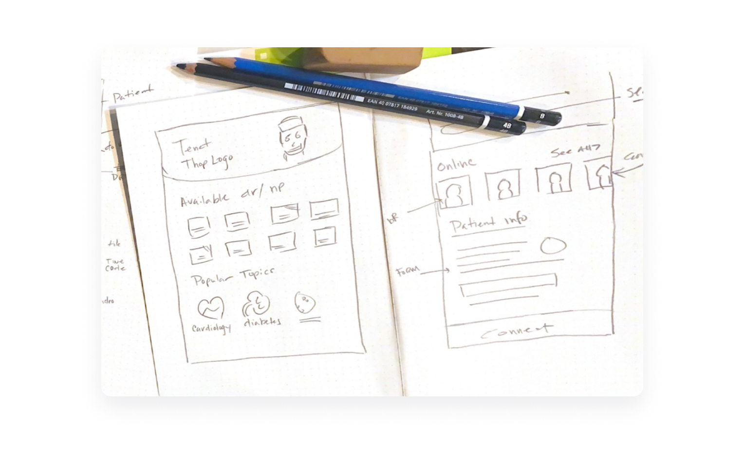
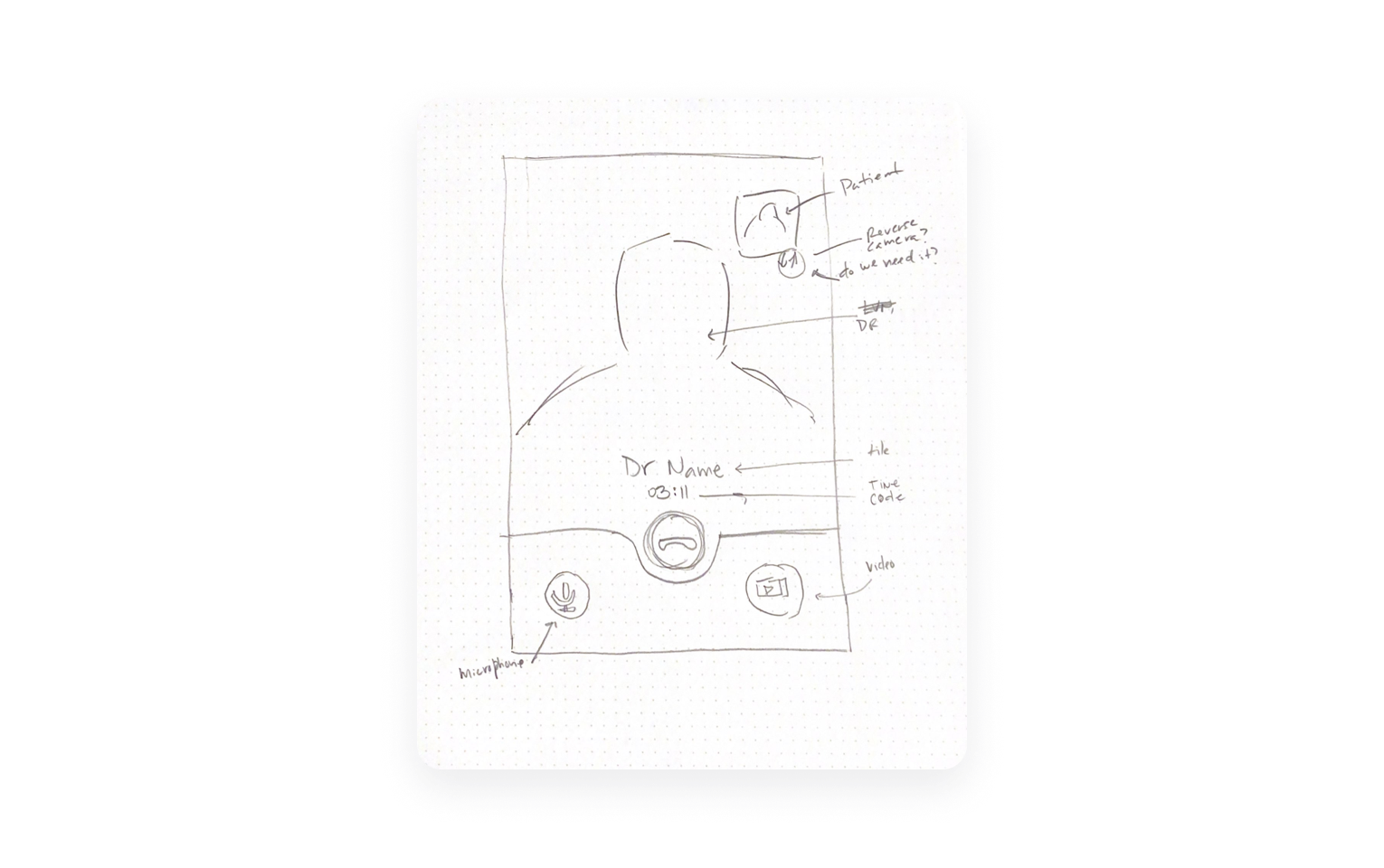
I started with simple, low-fidelity prototypes, ensuring usability was front and center. These early versions? It's super easy to whip up and change. It lets us try out many ideas without wasting too much resources.
After hearing what our users had to say, we quickly made some changes. We could see these changes making things better for our users right away. Once we felt good about our main ideas, we moved on to creating detailed prototypes. These prototypes gave us a clearer picture of the final product, helping us polish everything for the best user experience.
I proceeded to present our refined prototype at local health events. This wasn't merely a test, but an opportunity for our app to interact with the real world. We observed its functionality, gathered immediate feedback, and engaged with prospective users. This method ensured our app was developed based on genuine needs.
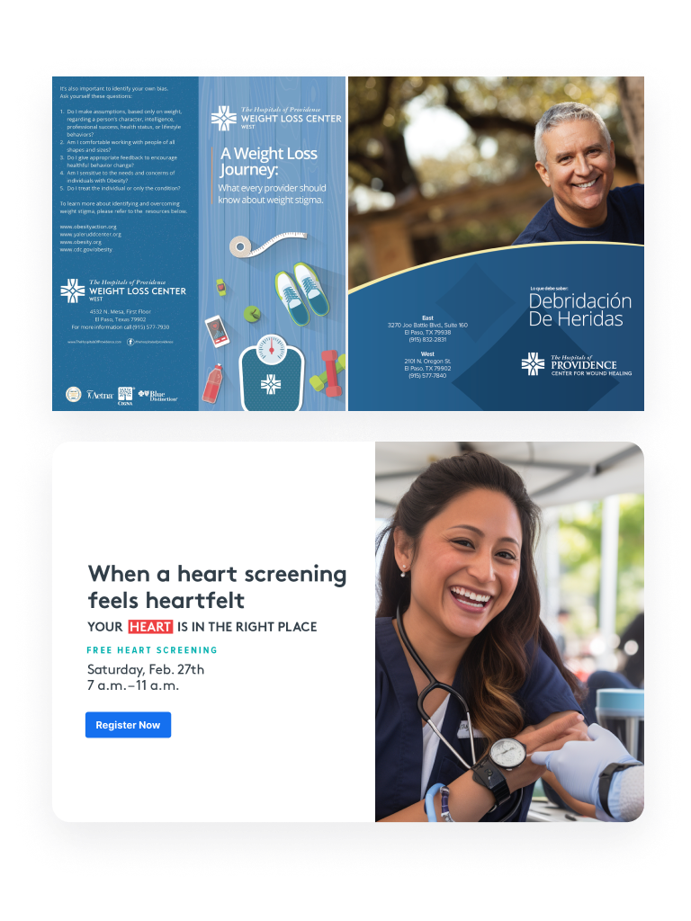
In addition, I produced several brochures and pamphlets. These materials were more than standard handouts; they were integral to our strategy to inform and connect with potential users. They were well-received and provided a tangible point of reference about our project.

Saving Costs, Boosting Health Choices
Health Outreach Program Statistics
Program Overview
Total participants: 783
Duration: 9 months
Number of health fairs: 12
Cost per interaction: $43
Outcomes
1. ER Visit Reduction
Participants reporting fewer ER visits: 28%
Overall ER visit reduction: 22%
2. Healthcare Access Improvement
Uninsured participants who obtained health insurance: 31%
Participants visiting a primary care provider for the first time or after a long gap: 45%
3. Health Education
Participants reporting increased knowledge about preventive care: 92%
Participants indicating at least one positive change in health habits: 76%
4. Cost Savings
Estimated savings in unnecessary ER visits: $287,000
Return on Investment (ROI): $3.15 saved for every $1 spent
Long-term Impact (12-month follow-up)
Participants maintaining regular primary care visits: 53%
Participants reporting sustained improvement in managing chronic conditions: 47%
